
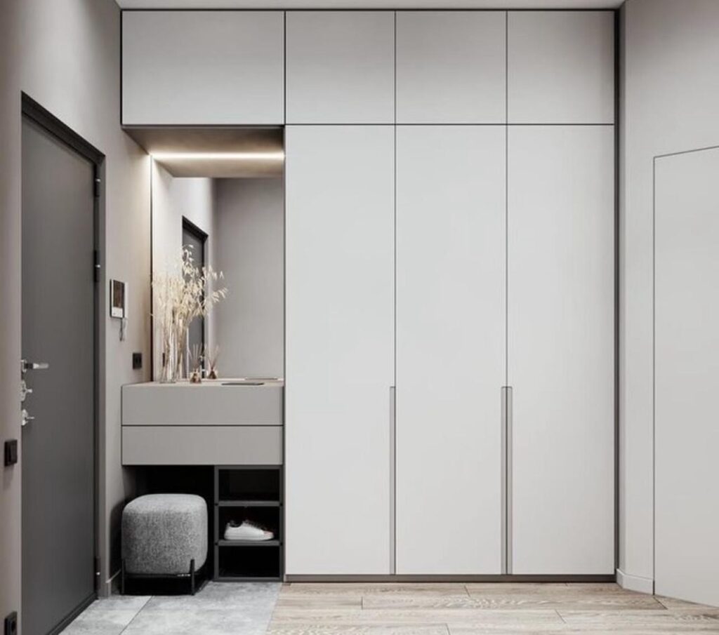


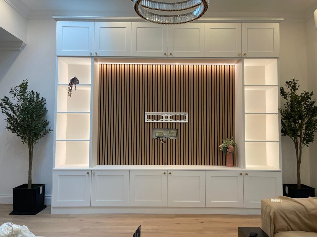


A media wall can look expensive, thoughtful and beautifully integrated – or it can end up feeling like a large television with a few rushed accessories around it. If you are wondering how to style media wall features so they feel refined rather than overfilled, the answer is usually restraint, proportion and a clear sense of how the room is actually used.
The best media walls do more than frame a screen. They help organise cables, soften technology, add storage and give the living room a calmer focal point. Styling is what turns that fitted structure into part of the home rather than a practical install that still feels unfinished.
How to style media wall without making it feel busy
The first decision is not what to place on the shelves. It is what role the wall should play in the room. In some homes, the media wall is the main feature and can carry more visual weight. In others, especially smaller reception rooms or open-plan spaces, it needs to sit quietly in the background and support the overall scheme.
That distinction matters because styling a media wall is really about balance. If the wall already has a fireplace, strong wood grain, fluted panels or contrasting paint, you may need very little else. If the cabinetry is simple and understated, accessories and lighting can do more of the work.
A common mistake is treating every shelf or niche as something that must be filled. Empty space is part of the design. It gives the eye somewhere to rest and allows individual pieces to stand out. A media wall with fewer objects often feels more bespoke, more expensive and easier to live with.
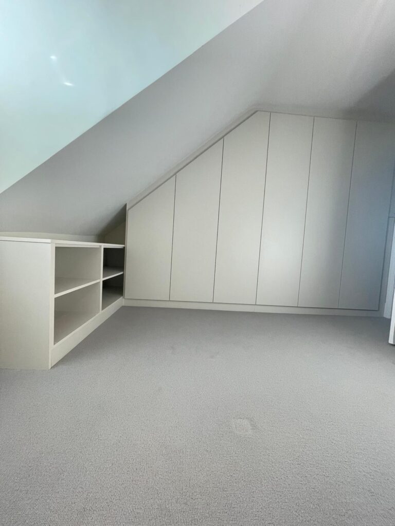
Start with the architecture, not the accessories
Before styling, look closely at the structure itself. Consider the finish, the shelf spacing, whether the television is centrally placed, and how the media wall relates to nearby elements such as sofas, coffee tables, alcoves and windows. Good styling always responds to those details.
If your media wall is painted in the same colour as the surrounding walls, a tonal approach usually works best. Ceramics, books and decorative objects in similar shades will keep the look calm and cohesive. If the unit features timber or a stronger contrast colour, you can be slightly bolder with texture, but it still helps to stay within a controlled palette.
Scale is just as important. A large wall with wide shelving can handle a few substantial pieces, such as a taller vase, a stack of large-format books or a sculptural object. Small accessories scattered across long shelves often look lost and create visual noise. In fitted furniture, proportion is everything.
Choose a simple colour palette
Most well-styled media walls rely on two or three main tones rather than lots of competing colours. That does not mean everything must match. It means the objects should belong to the same visual conversation.
Soft neutrals, black accents, warm timber, stone and muted greens tend to work well because they complement screens rather than fighting for attention. If your living room already has stronger colour through upholstery, art or rugs, let the media wall accessories be quieter. If the room is fairly neutral, a few darker or textured pieces can give the wall more depth.
Brass, smoked glass and ribbed ceramics can add polish, but use them with care. Too many metallic or reflective finishes around a television can feel hard and distracting, especially in evening light.
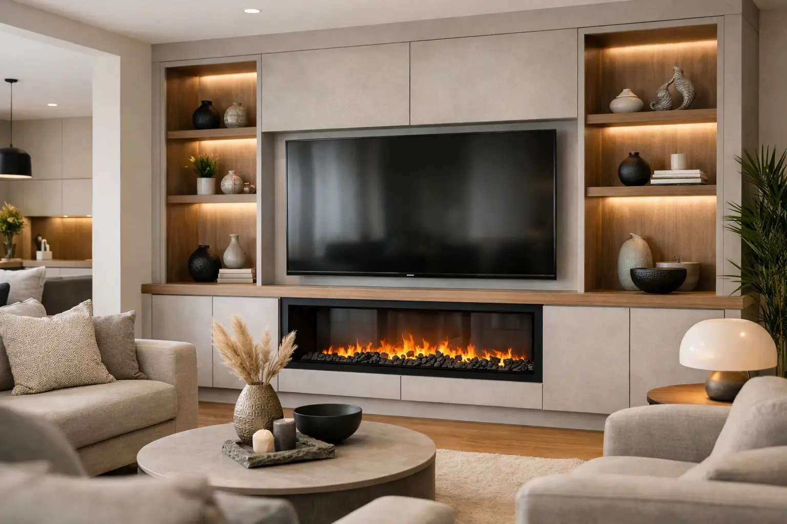
Layer texture to soften the technology
A television is a large black rectangle. Styling should counterbalance that with warmth and texture. Books, natural wood, linen-bound boxes, ceramic pieces and gentle planting all help soften the sharper visual impact of the screen.
This is particularly useful in homes where the living room needs to feel welcoming throughout the day, not only when the television is on. A fitted media wall should support relaxing, entertaining and everyday family life, so the design needs to feel complete even when nothing is playing.
What to put on a media wall shelf
The most effective shelf styling mixes practical items with decorative ones. Books are particularly useful because they add height, texture and a lived-in quality. They also stop the wall from feeling like a showroom display. Some can be stacked horizontally, others placed upright with bookends, but avoid packing shelves too tightly.
Ceramics are another reliable choice. A matte vase, a bowl or a simple sculptural form introduces shape without clutter. One larger piece usually has more impact than several small ones.
Artwork can work beautifully too, especially if leaned rather than formally hung within a niche. Smaller framed prints soften the built-in joinery and make the whole arrangement feel less rigid. Candles, boxes and a small number of meaningful personal objects can be added, but only if they contribute to the overall composition.
Plants are helpful, though they depend on light levels and maintenance. A trailing plant can soften a sharp shelf line, while a compact leafy plant can bring life to a more minimal scheme. Artificial plants are best used cautiously. If they look obviously artificial, they tend to undermine the tailored look of the furniture.
Styling around the television
Many people focus on the shelves and forget the central screen. The area around the television needs careful handling because too much decoration close to it can make viewing less comfortable.
Keep the immediate surround fairly calm. If you have side shelving, distribute accessories so the television still feels grounded at the centre. Symmetry can work well, but it is not essential. An asymmetrical arrangement often feels more natural, provided there is visual balance in height and weight.
If the television sits above a fireplace, styling should not compete with either feature. In that case, the joinery, the fire detail and the screen already create a layered focal point, so shelves may need only a few carefully chosen objects.
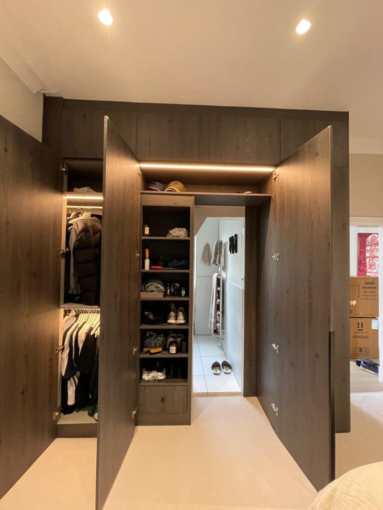
Cable management also matters more than people expect. Even the most elegant media wall loses its effect if wires, consoles or routers are visible. Thoughtful fitted storage allows the practical elements to disappear, which is why bespoke designs tend to feel so much more polished than improvised set-ups.
How to style media wall lighting properly
Lighting is often the detail that makes a media wall feel complete. It adds atmosphere, highlights texture and helps the fitted furniture hold its own when the television is switched off.
Integrated LED lighting within shelves or recessed sections can be particularly effective because it creates a soft glow rather than a harsh spotlight. Warm white tones are usually the safest choice for living rooms. Cooler lighting can make the cabinetry feel clinical.
That said, more light is not always better. If every shelf is brightly illuminated, the effect can feel overdesigned. The aim is to introduce depth and warmth, not to turn the wall into a display cabinet. It depends on the room, the finish of the unit and how often the space is used in the evening.
In many London homes, where natural light varies and living spaces often need to work hard across the day, layered lighting makes a real difference. A media wall should sit comfortably alongside table lamps, ceiling lights and any fireplace glow, rather than trying to do everything on its own.
Match the styling to how you live
The most attractive media walls are not styled in isolation. They reflect the household using them. A formal room used mainly for entertaining can carry a more curated look, with fewer practical items on show. A family room may need closed storage below, durable finishes and shelf styling that is simpler and easier to maintain.
This is where bespoke design has a clear advantage. If the wall includes concealed cupboards for games, remotes, speakers or children’s items, the visible styling can stay calm and elegant. That combination of beauty and usability is what gives fitted furniture long-term value.
It is also worth considering what sits opposite the media wall. If there is already a bold sofa, patterned curtains or statement lighting, the media wall should probably be more understated. If the rest of the room is quiet, it can take a little more design presence.
Common styling mistakes to avoid
The biggest mistake is overfilling every surface. The second is choosing accessories that are too small for the scale of the joinery. The third is ignoring the wider room, which leaves the media wall feeling disconnected from everything around it.
Another issue is chasing trends too closely. Very fashion-led styling can date quickly, while a more considered mix of timeless materials and a few personal objects tends to age much better. Since a fitted media wall is an investment, it makes sense to style it in a way that still feels right several years from now.
If you are starting from scratch, begin with fewer items than you think you need. Step back, assess the balance and add only what genuinely improves the composition. With media walls, confidence often shows up as simplicity.
A well-styled media wall should make the whole room feel more settled. When the proportions are right, the finishes are considered and the styling leaves space to breathe, the result is not just a better television area. It is a living space that feels properly designed around real life.