
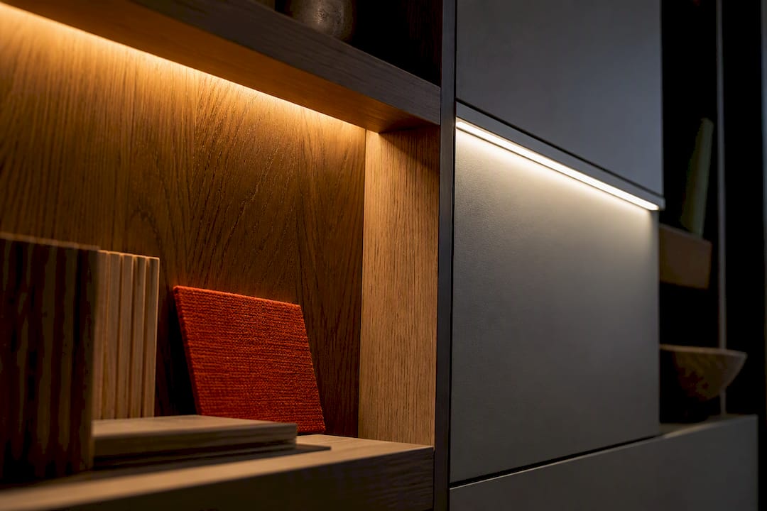
Use 3000K for comfort led rooms such as living rooms, bedrooms and wardrobes, and reserve 4000K for kitchens, bathrooms and home offices where sharp, neutral light helps you see clearly. Neither number matters much on its own. Colour rendering, lumen output and dimmer compatibility decide whether the light actually looks good once it’s fitted.
TL;DR:
- Warm lighting at 3000K enhances timber finishes and creates a relaxed atmosphere in living and bedroom spaces, while 4000K provides sharper, neutral white light for task areas.
- The appearance of light depends heavily on CRI, lumen output, and fixture quality; a poor CRI bulb at 4000K can distort skin tones and food colors regardless of Kelvin rating.
- Brightness is measured solely by lumens, so selecting the right lumen level for each task is more important than the Kelvin number itself for achieving the desired room feel.
- Always specify Kelvin during the design phase and test samples in situ before installation, since fixture characteristics can alter the perceived color of the light.
- Combining 3000K and 4000K throughout a house is advisable, with warmer tones in living spaces and cooler tones in kitchens, bathrooms, and work areas for optimal ambiance and functionality.
Table of Contents
- What does the Kelvin number actually mean?
- How do 3000K and 4000K actually look and feel?
- Which Kelvin suits each room in your home?
- What should you check on the lamp and fitting?
- How do you choose between 3000K and 4000K step by step?
- Specifying lighting for bespoke wardrobes and media walls
- A fitter’s take on getting this right the first time
- Sources
- FAQ
What does the Kelvin number actually mean?
Kelvin measures the appearance of light, not how bright it is. A candle sits around 1,800K. A cloudy sky reads closer to 6,500K. Everything you’ll consider for a home falls somewhere between those two extremes.
At 2700–3000K, light reads warm and amber, the kind of glow you’d associate with a table lamp or a fireplace. At 3500–4000K, it turns neutral white, clean without tipping into clinical. Above 5000K, you’re into daylight territory, the sort of stark white you see in supermarkets and hospital corridors. The Energy Saving Trust points to 2700–3000K as the sensible default for most household rooms, with 4000–4500K reserved for spaces that benefit from a cooler, more clinical feel.
Brightness is a separate measurement entirely, expressed in lumens, and colour accuracy is measured by CRI. You genuinely need to check all three before you commit to a fitting. Tunable white systems, which let you shift between warm and cool on the same fixture, are worth a mention too. They cost more but solve the “which Kelvin do I choose” problem by letting you choose both, at different times of day.

How do 3000K and 4000K actually look and feel?
Put the two side by side and the difference is obvious within seconds. 3000K flatters timber, warms skin tones, and settles a room into something closer to relaxed than alert. It’s why hotel lounges and restaurant dining rooms lean warm almost without exception. 4000K does the opposite. It sharpens edges, keeps whites looking genuinely white, and suits anywhere you’re reading small print, chopping vegetables, or checking your reflection.
The finishes in the room matter as much as the bulb. Warm oak or walnut cabinetry can turn slightly muddy under 4000K, while the same timber glows under 3000K. Cool grey worktops or crisp white paintwork can look flat and yellowed under 3000K but come alive under 4000K. That’s the interaction the Centre for Sustainable Energy flags when it describes cool white as the popular choice for kitchens and bathrooms, and warm white as the natural fit for living spaces.

CRI decides whether either temperature actually delivers on that promise. A poor CRI bulb at 4000K can still make skin tones look grey and food look unappetising, whatever the Kelvin figure claims. Mixing temperatures room to room, rather than forcing one number through the whole house, tends to produce a far more liveable result than most homeowners expect.
Which Kelvin suits each room in your home?
Every room has a job to do, and the lighting should match it. Here’s how it typically breaks down across a home:
- Living room and dining room: 3000K for general lighting and any feature pendants. Only step up to 4000K if you’re running a stark, minimalist scheme where cool light is part of the design language.
- Bedroom: 3000K for ambience, wall lights and bedside lamps. If you’ve got a dressing mirror or vanity area, a 4000K spot nearby helps you judge colours and makeup accurately.
- Kitchen: 4000K over worktops and hob areas for genuine task clarity, paired with 3000K under cabinets or over an island where you want a softer, more social glow in the evening.
- Bathroom: 4000K around the mirror for grooming and shaving, always on an IP-rated fitting given the moisture, and with as high a CRI as you can specify so skin tones don’t look off.
- Home office: 4000K for concentration and screen work, though a tunable or layered setup lets you soften the room once the working day is done.
- Wardrobes and media walls: 3000K is the usual preference for built-in lighting, since it flatters fabrics and creates an inviting glow rather than an interrogation-room effect. Whichever temperature you land on, it needs specifying before manufacture, not after.
For fitted furniture specifically, this decision has to happen at the design stage. Our guide on luxury walk-in wardrobe lighting ideas covers this in more depth if you’re planning a dressing area.
What should you check on the lamp and fitting?
Two lamps can carry the identical Kelvin figure on the box and still look nothing alike once they’re switched on. Fittings, diffusers and phosphor quality all shift the outcome, which is why Museum Development South East warns that appearance depends as much on the fixture as the stated colour temperature. Run through this before you order anything:
- Check the CRI rating. Aim for CRI 90 or above for wardrobes, media walls, and anywhere colour accuracy genuinely matters.
- Match lumens to the task, not the wattage on the old bulb you’re replacing. A dim, warm hallway needs far fewer lumens than a kitchen worktop.
- Confirm dimmer compatibility and check the driver specification against your existing dimmer switch before fitting.
- Look at the optics and diffuser type. A frosted diffuser softens and spreads light; a clear lens concentrates it into a tighter, more directional beam.
- Test a sample against your actual finishes, in the room, at normal evening light levels, before you order the full run.
Pro Tip: Hold your sample lamp beside the actual door finish or worktop material at 8pm with the curtains closed, not at midday with sunlight flooding in. Daylight washes out subtle colour shifts that become obvious once the sun goes down.
How do you choose between 3000K and 4000K step by step?
Work through this in order rather than picking a Kelvin figure first and hoping the room adapts to it.
- Define the room’s primary activity. Relaxing, cooking, working, dressing? That answer points you straight to a starting Kelvin.
- Specify CRI, lumens and dimmability together, and ask for manufacturer datasheets rather than relying on the box copy.
- Lock the Kelvin during the design phase if bespoke furniture is involved, and request a physical sample before manufacture begins.
- Buy a sample, test it in-situ, then place the full order once you’re confident it reads correctly against your finishes.
Rushing straight past step three is the single most common reason homeowners end up unhappy with fitted lighting. Once a wardrobe or media wall is built and installed, changing the LED channel means partially dismantling the joinery, not simply swapping a bulb.
Specifying lighting for bespoke wardrobes and media walls
Many bespoke wardrobe and media wall projects benefit from 3000K lighting as it complements timber finishes and evening viewing. It sits comfortably with warm oak, walnut and shaker style doors, and it doesn’t fight with the room’s existing lamps.
The technical decisions matter just as much as the Kelvin choice. Driver location needs planning early, so it’s accessible for servicing without pulling the unit off the wall years later. Dimmer choice needs confirming against the driver’s own specification, not assumed. We always recommend on-site sampling or a small mock-up before the concealed LED channel goes into full production, because a channel that looks right on a supplier’s website can read completely differently against your actual paint colour and daylight direction. Our guide to planning fitted wardrobes properly walks through how we sequence this alongside the joinery design.
If you’re weighing up lighting alongside your home’s broader energy use, this step-by-step UK guide to energy efficient homes is a useful companion resource for getting the wider picture right.
Ready to see how this looks in your own space? Book a free design visit and we’ll bring sample lighting so you can judge the effect against your own walls and finishes, not a showroom mock-up. Bespoke wardrobes are typically installed quickly, projects may be supported by a workmanship guarantee, and old wardrobes are often removed and disposed of as part of the service. Call or WhatsApp 07468 150807, or visit us at 124 City Road, Kemp House, London, EC1V 2NX.
A fitter’s take on getting this right the first time
Most lighting disappointments trace back to skipping the sample stage, not the Kelvin choice itself. Prioritise CRI over the marketing label, and plan lighting alongside the furniture design rather than bolting it on afterwards.
— Aureliu
Sources
For further reading, the Energy Saving Trust and Centre for Sustainable Energy both offer clear consumer guidance on household lighting. Dextra Group and Museum Development South East cover the technical side of colour rendering and dimmer compatibility in more depth.
- Energy saving light bulbs and lighting – Energy Saving Trust
- Museum Development South East (LED guidance)
FAQ
Is 4000K too bright for a living room?
Brightness depends on lumens, not Kelvin, so 4000K itself isn’t automatically too bright. It can, however, feel too clinical for relaxed evening use, which is why the Energy Saving Trust suggests warm white as the more comfortable default for living areas.
Is 4000K too yellow?
No, the opposite is true. 4000K reads neutral to cool white, while 3000K is the warmer, more yellow tone. If you want to avoid any yellow cast, 4000K is the closer match.
Which is better for a living room, 3000K or 4000K?
3000K generally suits living rooms better, since it flatters timber and fabric and supports a relaxed evening atmosphere, a point echoed by the Centre for Sustainable Energy. Some contemporary, minimalist schemes work with 4000K instead, but it’s the exception rather than the rule.
Is 3000K too bright for a living room?
3000K describes warmth, not brightness, so the fitting’s lumen output is what actually determines how bright the room feels. Choose the lumen level for the room size and task, then use 3000K for the warm, comfortable tone most living rooms are after.
Can I mix 3000K and 4000K in the same house?
Yes, and it’s often the better approach rather than a compromise. Using 3000K in living rooms and bedrooms while switching to 4000K in kitchens, bathrooms and home offices lets each room’s lighting match what actually happens in it.

