
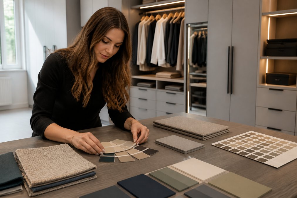
Table of Contents
- Start With the Room, Not the Swatch
- Bespoke Wardrobe Colour Palettes That Work in 2026
- Modern Fitted Wardrobe Styles 2026: Finishes, Doors, and Details
- The Impact of Lighting on Wardrobe Finishes
- Choosing Wardrobe Door Colours: Tonal Matching and Statement Choices
- How to Test Colours and Coordinate With Existing Furniture
- How to Choose Bespoke Wardrobe Colours That Last
- Conclusion
- Frequently Asked Questions
Last Updated: September 15, 2026
Start With the Room, Not the Swatch
Choosing bespoke wardrobe colours is a decision about light, proportion and permanence, not a quick trip to a paint aisle. This guide from Finest Furniture Studio covers the steps that separate a wardrobe you still like in a decade from one you regret by year two.
The single biggest mistake is starting with a colour you love in isolation. A taupe that looks rich on a small sample can turn grey and flat against a north-facing wall. A warm greige that feels calm in a showroom can read yellow under a bedroom’s warm bulbs.
Colour is the last decision in a fitted wardrobe project, not the first. Get the room’s light, dimensions and existing materials right, and the palette almost chooses itself.
Bespoke Wardrobe Colour Palettes That Work in 2026
Three families dominate current interiors: warm neutrals, earthy nature-inspired tones, and deep moody shades. Each behaves differently depending on room size and light, so match the family to the space before you match it to a trend.
Warm neutrals: greige, taupe, and cashmere
Greige, the grey-beige hybrid, remains the safest choice for most bedrooms: it sits between cool grey and warm beige, flattering both north and south-facing rooms. Taupe adds more brown and depth; cashmere leans softer and lighter, suiting smaller rooms where a darker tone would close the space in.
These shades work because they are quiet, letting the room’s architecture, bedding and artwork do the talking.
Earthy tones and nature-inspired shades
Olive green, clay, warm stone and muted terracotta have moved from accent colours to full wardrobe runs, picking up woodgrain and natural finishes rather than competing with them. A common mistake is choosing a saturated earth tone for a whole wall of doors: these shades work best when they echo something already in the room, a floor, a rug, a piece of timber. If nothing else is earthy, the wardrobe looks like it arrived from a different house.
Dark and moody options: charcoal grey and soft black
Charcoal grey and soft black create a deliberate, enveloping look, particularly in larger bedrooms with good natural light. In a small or dim room, though, a dark run of doors absorbs light and makes the space feel tighter. For the moody effect without the shrinkage, keep the carcass and interior light and reserve the dark tone for the door fronts only.
Modern Fitted Wardrobe Styles 2026: Finishes, Doors, and Details
Finish and door design change how a colour reads as much as the colour itself. The same charcoal looks entirely different in matte and in gloss, and a handleless door changes the geometry of a wall.
Matte vs. gloss finishes
Matte finishes diffuse light and hide fingerprints, smudges and minor surface marks, which makes them the practical choice for busy households. Gloss reflects light back into the room, so it can lift a darker space, but it shows every mark and can look dated faster.
For most bedrooms, matte wins on durability and calm. Reserve gloss for smaller, lighter rooms where you genuinely need the reflected light.
Handleless and seamless door designs
Handleless doors, whether push-to-open or with a routed finger pull, create an unbroken plane of colour across the wall, making a fitted wardrobe read as part of the architecture rather than furniture parked against it. The trade-off is tighter tolerances: gaps must be consistent, with no hardware to distract the eye.
The Impact of Lighting on Wardrobe Finishes
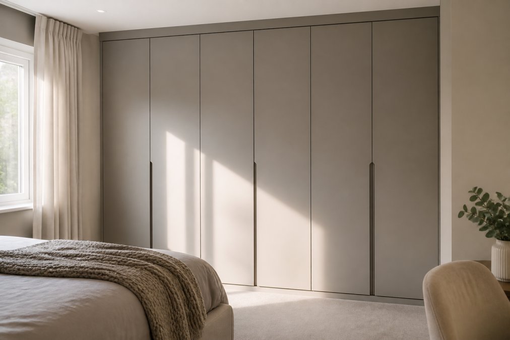
Lighting decides what your chosen colour actually looks like once installed. Every finish shifts depending on whether a room is lit by daylight, warm bulbs or a mix of both, and that shift is often larger than the difference between two similar swatches. This is the most common reason a finish that looked perfect on a sample board reads wrong on a finished run of doors.
How room orientation changes a colour
North-facing rooms receive cooler, more indirect light for most of the day, pushing warm neutrals towards grey and making cool tones feel genuinely cold. A greige that looks balanced in a south-facing showroom will often read several shades cooler on a north wall.
South-facing rooms get warmer, stronger light that lifts earthy and dark shades but washes out pale yellows and creams. East-facing rooms shift through the morning, so a colour rich at 8am can flatten by midday; west-facing rooms do the reverse, staying cool until the late afternoon.
Artificial light is not neutral
Most bedrooms are used under artificial light for the hours that matter most. Warm white bulbs, around 2700K, add a yellow cast that intensifies warm neutrals and can turn a cool grey slightly green (Is your Business Continuity Plan ready for a super El Niño?). Cooler bulbs, around 4000K, flatten warm tones and make earthy shades look duller than in daylight.
A practical rule: match your sample viewing to the light you actually live under. If you read in bed under a warm lamp, judge the finish under that lamp, not the ceiling light alone.
A sample testing protocol that actually works
A 5cm swatch tells you almost nothing about a 3m run of doors. Order large samples or A2 boards in your shortlisted finishes and live with them for at least a week. Then:
- Tape samples to the actual wardrobe wall, not a nearby one; light falls differently on adjacent walls.
- View them at three times: morning, mid-afternoon and under evening lighting.
- Check them against your flooring, bedding and any timber you are keeping.
- Look at them from the bed and the doorway, the two angles you will see most.
- Photograph each sample at each time of day, then compare the shots side by side on a neutral screen.
- Narrow to two options, then decide which you would still choose in five years.
Cameras exaggerate some undertones and hide others, but comparing shots side by side quickly exposes which samples turn muddy or yellow when the light changes, eliminating finishes that looked fine in isolation.
Why the same colour reads differently in matte and gloss
Tonal matching versus statement choices
Do not finalise a dark or high-gloss finish purely from a showroom display. Showroom lighting is engineered to flatter, and a shade that looks rich there can read flat and cold in a dim bedroom. Always confirm in your own room first.
Choosing Wardrobe Door Colours: Tonal Matching and Statement Choices
There are two defensible approaches to door colour: blend in or stand out. Tonal matching means selecting a wardrobe shade close to your wall colour so the fitted run recedes into the room, which makes compact bedrooms feel larger and more considered.
The statement approach treats the wardrobe as a focal point: a deep charcoal or olive run against pale walls, or a colour-drenched scheme where walls, doors and trim share one tone. Colour-drenching is the more confident option and works best in rooms with generous light and clean lines.
Neither is wrong. What fails is the middle ground, a wardrobe that is neither matched nor clearly contrasting, which just looks like it does not belong.
How to Test Colours and Coordinate With Existing Furniture
Test finishes properly before committing, because a 5cm swatch tells you almost nothing about a 3m run of doors.
Photograph your samples in the room at different times of day, then compare the shots on a neutral screen. Cameras exaggerate some undertones and hide others, but side-by-side comparison quickly exposes which samples turn muddy or yellow when the light changes.
How to Choose Bespoke Wardrobe Colours That Last
How each finish family wears over time
What actually causes a finish to fail
A simple maintenance routine
Matching the finish to the room, not just the trend
Choose the finish for how it will wear, not just how it looks on the sample board. Mid-tone matte finishes are the safest long-term bet; dark matte and gloss finishes need more care and frequent cleaning to stay sharp.
Conclusion
Frequently Asked Questions
Should my bespoke wardrobe match my wall colour?
Tonal matching, where the wardrobe sits a shade or two away from the wall rather than an exact match, usually looks more considered than a perfect colour match. A colour-drenched approach, painting the wardrobe and walls in closely related tones, makes the unit recede and can make a smaller room feel calmer. If you want the wardrobe to read as a statement piece, a deliberate contrast such as a charcoal grey unit against warm neutral walls works well. Test both options with large samples before deciding.
Do dark wardrobe colours make a room look smaller?
Not automatically. A dark finish on a large, flat run of doors can visually recede and make the wall feel further away, provided the room has enough natural or artificial light. The risk is a dark wardrobe in a poorly lit room, where it can feel heavy. Charcoal grey and soft black work best in bedrooms with good ambient lighting, or when paired with lighter flooring and pale walls to balance the depth.
How does natural light affect bespoke wardrobe colour selection?
Natural light changes through the day, so a finish that looks warm and soft at midday can read cooler and greyer by late afternoon. North-facing rooms tend to make warm neutrals look cooler, while south-facing rooms intensify them. Always view samples in the actual room at different times of day, and check them under your artificial lighting too, before committing to a bespoke wardrobe colour.
How do I choose a timeless colour for a bespoke wardrobe?
Stick to warm neutrals such as greige, taupe, or cashmere, which sit comfortably with most interior design trends and age well. These tones work with woodgrain, natural texture, and both matte and gloss finishes. If you want something bolder, use it on a single statement section or an internal accent rather than the whole run of doors. Sample testing in your own room is the most reliable way to confirm a colour will still feel right in ten years.

